Published: September 7, 2018
Micro-interactions – Small by nature, big on impact
Micro-interactions are everywhere online and though you may not be aware of them, you’re engaging in micro-interactions all the time.
To the average social media user, an example of a microinteraction is double tapping a picture on Instagram and the white heart popping up. Usually we take this subtle type of engagement as a given, but it actually changes the whole dynamic of a user’s experience.
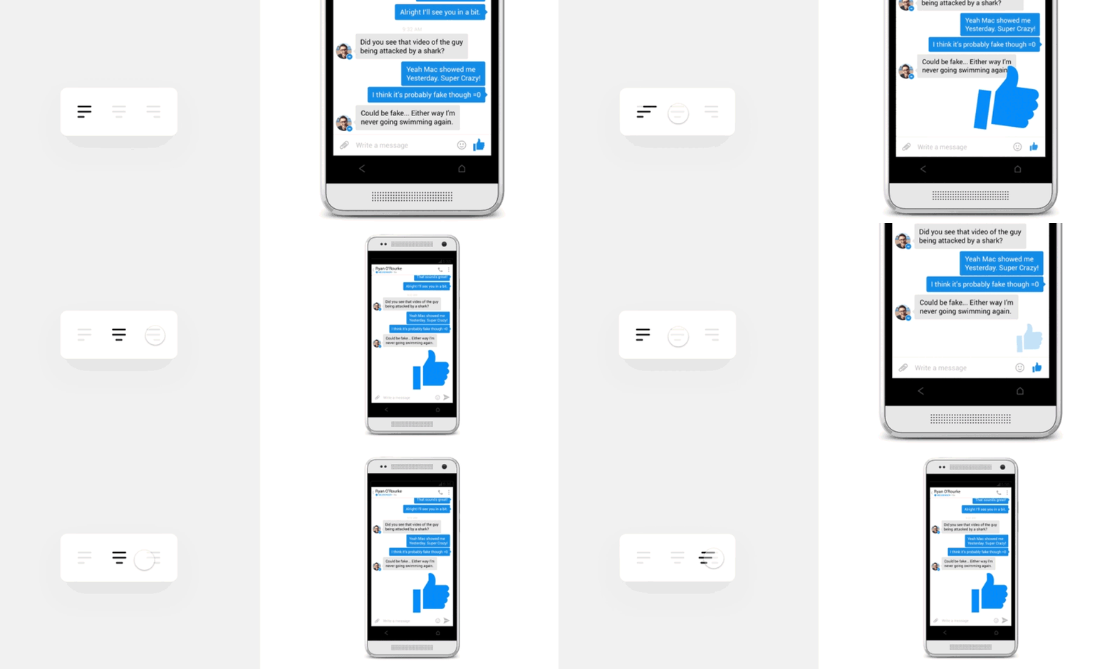
These interactions can be as simple as changing the alignment in a paragraph. Perhaps the button animates across the screen. Micro-interactions often improve the user experience for the better, whether this is simply enlarging content and key messages, or providing more of interactive experience.

In some cases simplicity is the way forward.
Alternatively, these gifs/animations are a great way to convey ideas, if they’re used on a larger scale. An animating logo can captivate the whole feel of a brand. This animation by Adam Grabowski, alludes to the ethos of Google. Colourful, fun, engaging and quite unexpected.

As a designer, seeing an image come to life is always refreshing, especially when it’s completely unpredictable.
Ultimately, incorporating micro-interactions into your designs whether it be small or big can boost your engagement, brand and really just bring your designs to life in a cool contemporary way.
Need further assistance? Get in touch today on 01604 250 900.
Words: Michael Foster

